Sunday, June 20, 2021

Postcard Mail Art

I’ve gotten quite lucky of late to receive Postcrossing names that are open to receiving handmade art postcards.  It helps to satisfy my desire to make art on a small scale.  Then send it out into the world.

This first postcard is a terrible blurry photo.  I can’t believe I didn’t notice that.  I have to post it at a small size in order not to damage anyone’s eyesight.


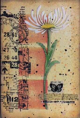
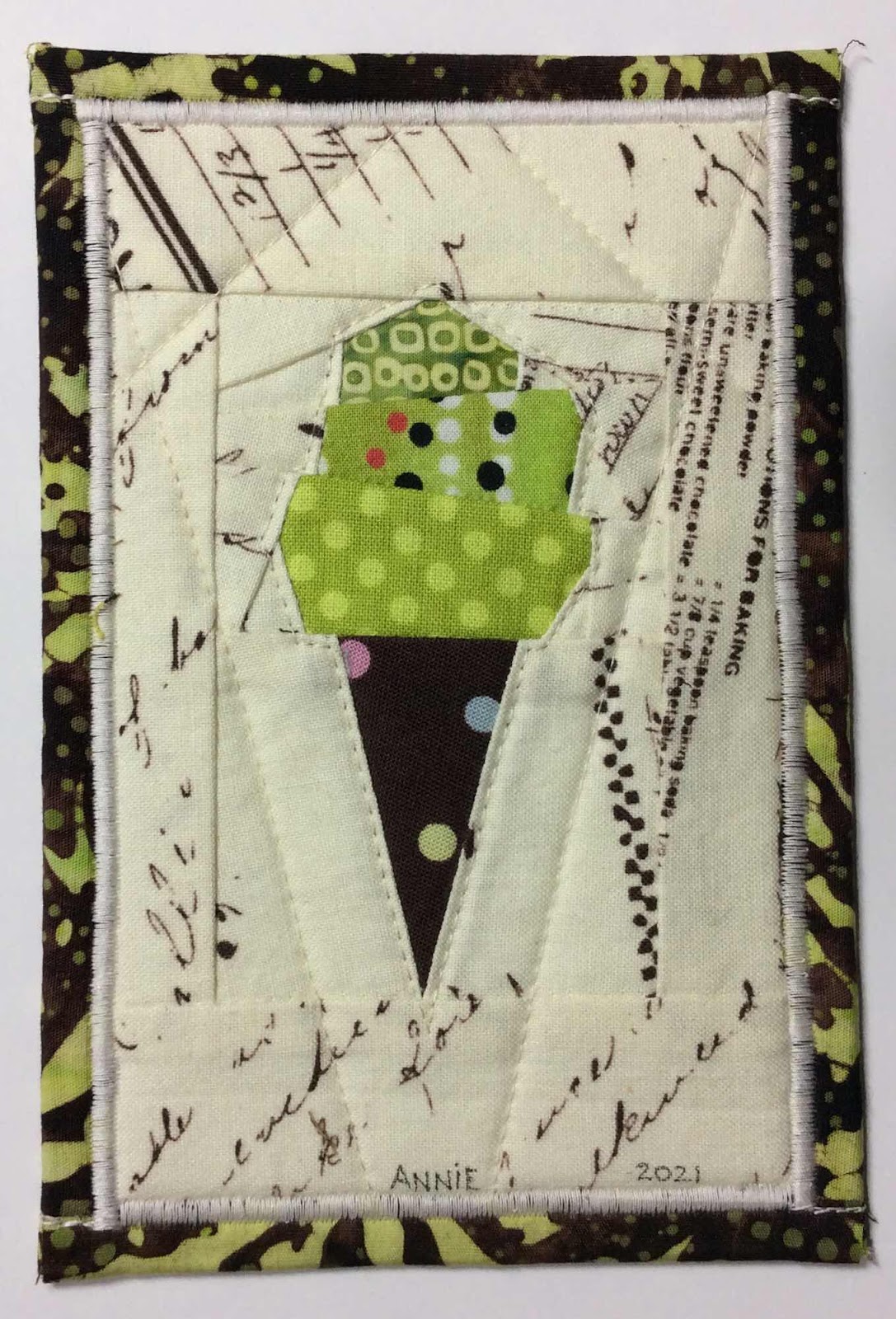
This next one was a request for a private swap.  We decided on collage.  My favorite art.


This next card started with this collage base of paper strips.  This was my first time using Collage Medium.  I definitely don’t get along well with this glue medium...yet.  This is the only process photo I took.


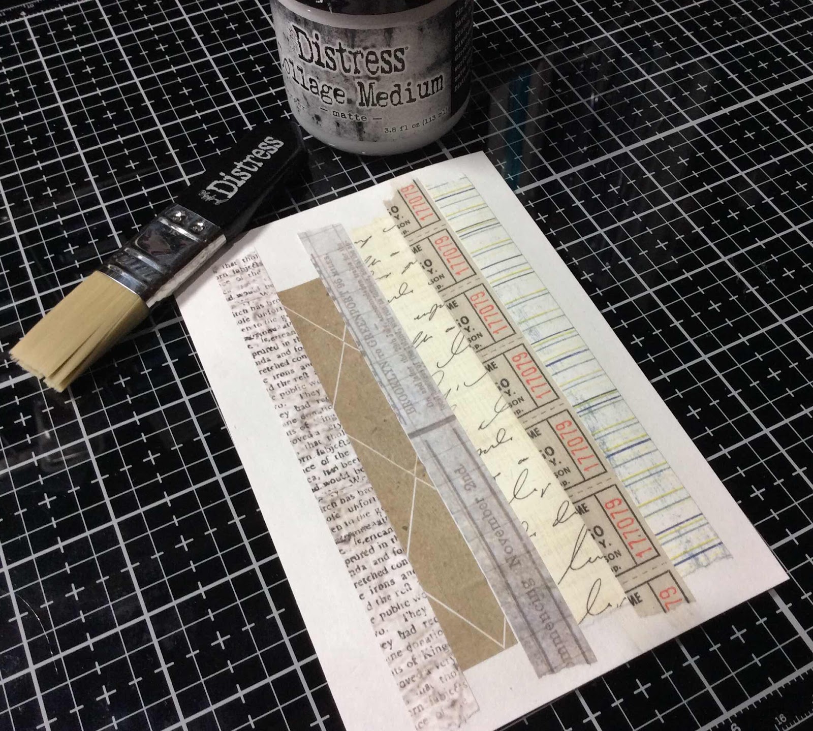
But I was happy with my end result.


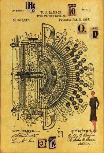
Next, this postcard was quite fun to create.  The Postcrosser said she liked postcards about postcards.  So this was my design side.  She’s been in Postcrossing for a lot of years and had already sent and received some 5,000+ postcards.  I’m rather certain this will not be a duplicate.


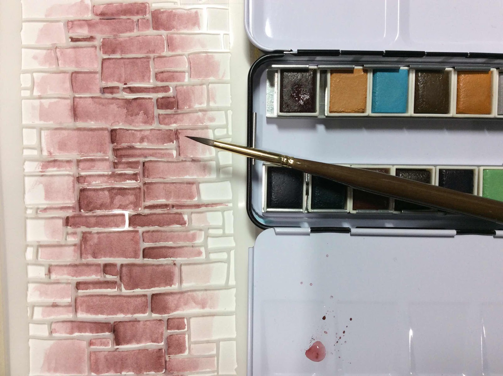
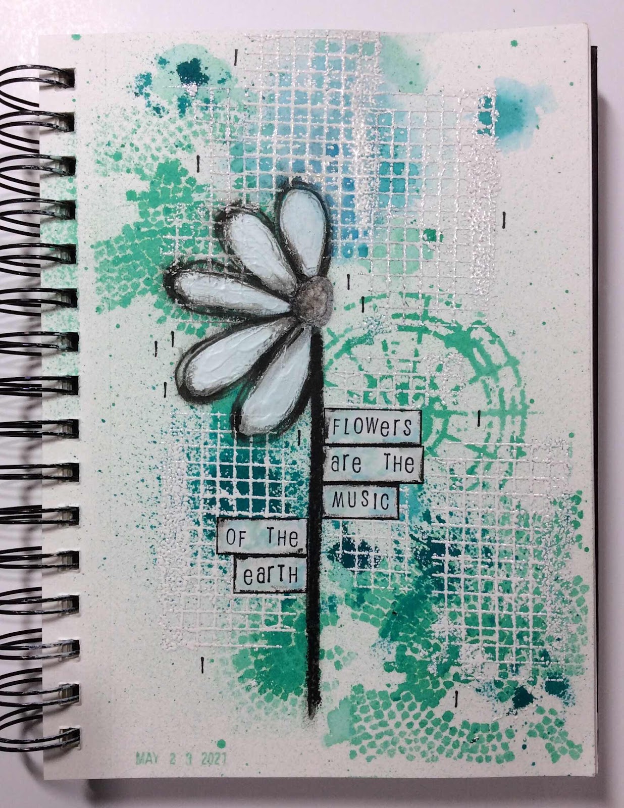
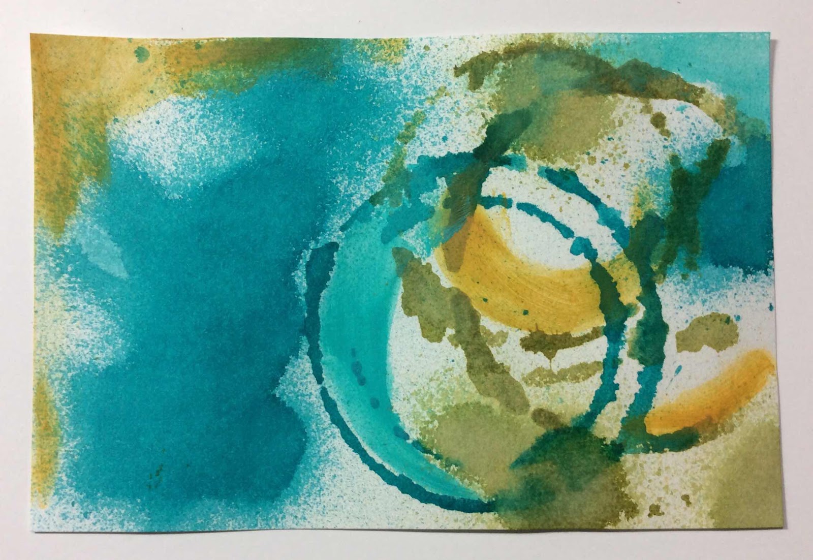
This last postcard was an experiment with paint and stencils and a bit of Distress inks.  The background got kind of busy on me but I didn’t totally dislike it so I continued to add stenciled numbers, washi tape and modeling paste through stencils.


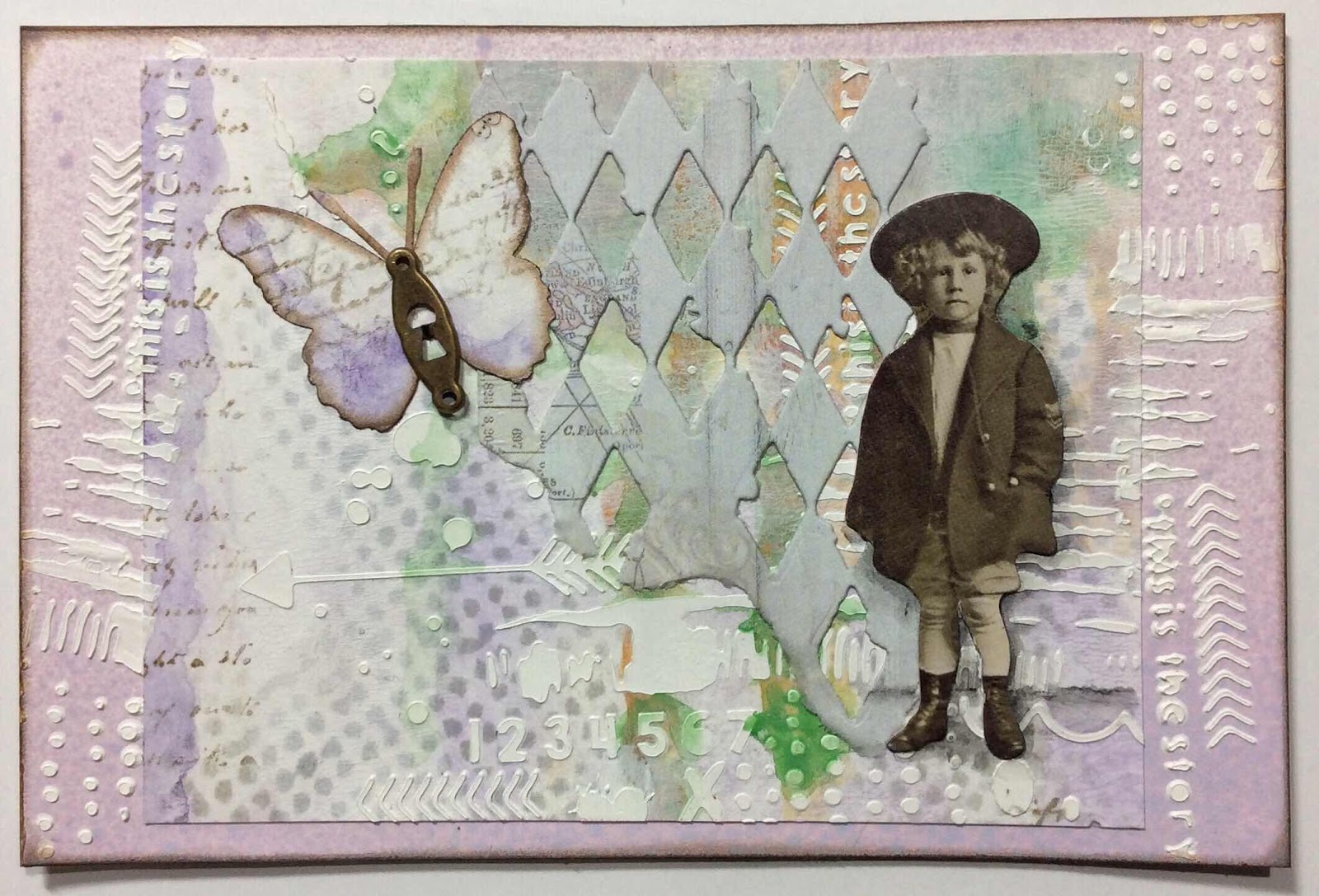
These Tim Holtz paper dolls women seemed a good fit for this correspondence postcard.  After being pen pals since they were young girls, they finally get to meet in person.
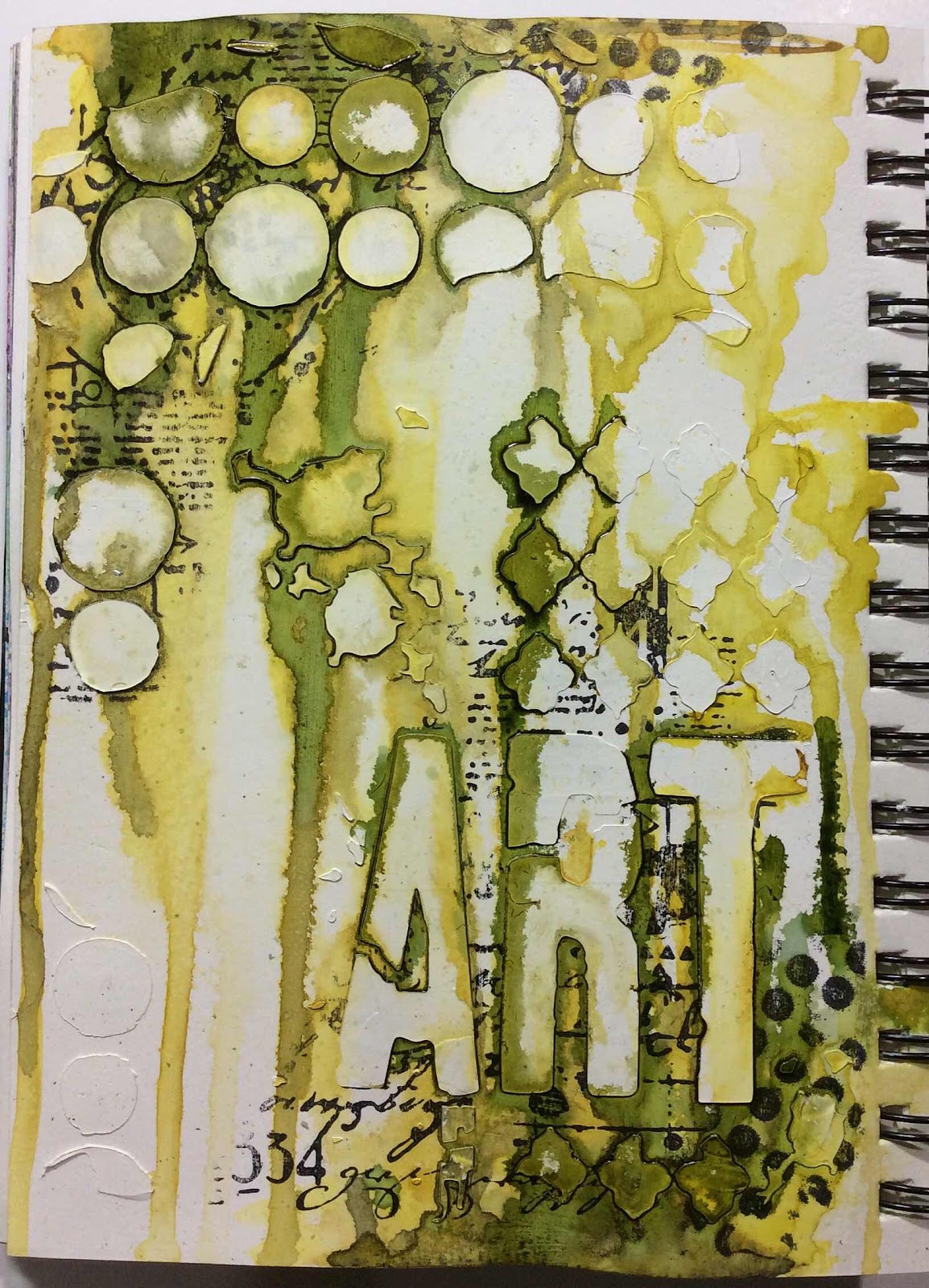
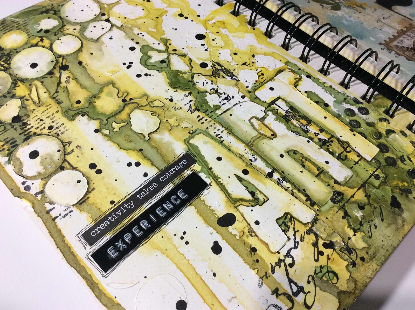


HAPPY ART MAIL DAY!

Thursday, June 10, 2021

Experience Art Journal Page and Tag

I am experiencing art techniques that I haven’t ever tried before.


First I painted the blank page with white Gesso.  I’m not sure why.  It’s just what I’ve seen other artists do.  Good reason, eh?


Then I stamped with Archival black ink with a large rubber stamp.  Next I scraped white modeling paste through a couple of stencils.  When the modeling paste dried, I used watercolors very wet and pigment applied to the top of the page.  I spritzed the paint with water to help the color drip down the page.  Then some black splatters with black acrylic paint watered down some.

I turned my journal upside down and did the same from the bottom.  Let me tell you...that is fun as well as rather unpredictable.


It all looks like a mess and almost ugly and I love it!


I used a Tim Holtz Small Talk sticker for the phrase and a label maker for the word experience.


This is a technique that I need to practice and fine tune.

Today I wanted to make a tag.
I’m linking my tag to Tag Tuesday where the theme this fortnight is FACES.


I’ve joined a free week long daily video demonstration at Willa Workshops called Fodder Challenge.  This particular day was Workbench Remnants by DeeDee Catron.  She made the chevron fodder.  I had the same stamp and wanted to make one too.  Then I needed something to put it on.  A tag was born.

I love these scribbly, sketchy line drawn ladies by Clearly Impressed, The Unruly Girls Club.  I’ve had these stamps forever and they’ve hardly been stamped on anything.  But they are going to make appearances on tags at least.  Because they’re fun.


Girls just wanna have fun...and I am!

Friday, June 4, 2021

Art Journal Page

One of the faux postage stamps I made and shared in my previous post has made it onto an art journal page.


It was just what was needed to finish off the page.

The theme this month at Art Journal Journey is BUTTERFLIES.

I didn’t think this page would turn out to be a keeper, so I did not take process photos.


The background is Distress Spray Stains in Speckled Egg, Stormy Sky and Antique Linen.  Splattered with Distress Oxide Spray in Speckled Egg and some white correction fluid.  The Xs are white acrylic paint pounced through a stencil with a make-up sponge.

The numbers are rubber stamps in various sizes along with portions of a couple of text stamps all stamped with archival ink.


I love how the spray stains moved over into the binding.

Then I very carefully glued some pressed flowers and leaves onto the page.  They are so delicate and fragile to handle.


The pressed flowers were totally not in my original thought process for this page.  But when all else failed and I spotted them on the shelf, I thought, well, let’s see.  I still didn’t want to use them.  As you can see, they won out as what was to be on this page.

Many times the art knows best.


Overall, I’m pretty happy with this art page.  I’m protecting this page from the page facing it with a sheet of  clear acetate attached with a glue dot on the inside corners.  The facing page has the potential to be unkind to these delicate pressed flowers.

Faux Postage Fun

Faux postage making was a fun afternoon of paper play.


From other challenge blogs, I have found Try It On Tuesday .
This fortnight they are challenging artists with BUTTERFLIES.
Butterflies are a favorite to add to art.

I’ve made faux postage before that was a part of the inking and stamping design.  I hadn’t made separate pieces to use as ephemera.  So it was fun to make these.

I had a postage edge die that I’ve not used much.  It was perfect for these.  Cut, they measure 1.75” X 1.25”.  Paper scraps are perfect for making these.  I cut the base paper and inked the edges.
I cut a lighter scrap using the same die then cutting off the postage edges and inking the straight edges.
The two pieces are then glued together.


Then the search for designing the stamps...the really fun part.


That roll of Washi tape has 5 different butterflies on it.
I’d made 7 bases so I used a bicycle washi tape and then a small flower rubber stamp colored with Tombow markers.  


These ephemera pieces are going to be fun to add to my art.

May 2021 Calendar Journal


Monday, May 31, 2021

Postcard Crazed!

I’ve been a crazed postcard paper crafter lately.

All of these postcards have been mailed for Postcrossing .
  Although I don’t get to create a handmade postcard for most postcrossers, I do get pretty lucky sometimes and get to make several to send across the world and across my own country.

T

Many of them have been to try out a technique.  This one is watercolors painted using a brick stencil as a guide.  Once I removed the stencil I gave the bricks a bit more fine tuning of color.


Then gave the brick wall a collage.  The flowers are die cut from white and painted with watercolors.
Adding a bit of number ephemera, washi tape and die cut numbers.


These city buildings die cuts are always a favorite the way others use them.  I painted them with watercolors...oh, so many times!  A strip of washi tape along the bottom.


I’ve made this typewriter postcard before with a different background.  I love this stamp.  The background is Distress Oxide Spray.  I then added Washi Tape bits.


Sometimes a Postcrosser requests a private swap.  She requested a fabric postcard.


This next card started with Distress Oxide Spray.  I then ran it through my BIGkick inside an embossing folder for texture.  I used a steam roller (brayer) to flatten the texture a bit.  Then I blended over the surface with an Oxide ink pad and blending tool.


I used glossy clear texture paste mixed with a red acrylic paint.  Then applied it pressed through a stencil.
I used a graphite pencil to give the letters shadow and depth.  Using a water brush to fine tune the shadowing.


White modeling paste was pressed through a chevron stencil.  Water based inks usually will tint the white modeling paste.


The stencil used on this next card is a very thin flimsy one.  I wanted to know how it would work trying to press modeling paste through it.  It worked well enough with care, but I prefer to stick with the sturdier plastic stencils.  


I used modeling paste through stencils on this next card.  I then used a cutting die to cut the circles.  I stamped words on the yellow backing paper before adhering the top card to it.  The flower is a die cut painted with watercolors.


If you’ve stuck with me this far, then you can have a chance of receiving this next postcard in your mail.

This postcard was made with rejected and extra pieces of bits and bobs.  Some art might be rejected for its original purpose, but it can soon become a perfect part for another art piece.  I love this postcard.  I wasn’t able to let it go for awhile.  But it is time now for it to travel to a new home.
Simply let me know in a comment if you’d like to received it.


HAPPY MAIL DAY!

Tuesday, May 25, 2021

Quiet Music

Music can be seen as well as heard.

Flowers are the music...


I’ve made another art journal page inspired by the theme LANGUAGE at Art Journal Journey .
Also inspired by this Pinterest pin https://pin.it/73QjtTc

To get some color speckles all over my page, I placed my journal inside my spray painting box and lightly spritzed Cracked Pistachio Distress Spray Stain holding the bottle about 18” above the page.


I then used some stencils to direct intense color through the designs.


After the stencils I sprayed very close to the page to get spots of intense color over the page with Cracked Pistachio and Peacock Feathers Spray Stains.


I then embossed the grid stamp with white embossing powder.  That made the ink blobs blend into the background.
(I’ve been using black archival ink to emboss over. I really should get a clear embossing pad.)


I don’t draw well or easily, so I traced a portion of a flower cutting die with pencil then went over the pencil lines with an 8B graphite pencil.


The flower petals were painted with a white heavy-bodied acrylic to give the petals some texture.  It was here the top ink blob looked quite out of place.  I worked at it for awhile using a variety of ways to get it blend into the background.  It refused.


My final attempt before trashing the page was to just add more embossing.  Although I now had more embossing than I wanted, it did save the page well enough.


I wet the graphite pencil with a water brush to outline the flower petals, but it just wasn’t bold enough.  I am new to Distress Crayons.  But they’ve done the job.  And we all know how I love a bit of grunge.


I stamped the words on white cardstock, added hints of the colors and grunged the edges.  I placed them as leaves for the flower.  The original quote says “ Flowers are the music of the ground...”. But I liked the word earth better than ground.


I love these colors.  I attempted to make a postcard in a similar fashion but I ended up with color all over.  That worked out fine to white emboss, add modeling paste through a stencil and a white die cut  to decorate all the color.
If you’d like to receive this postcard in the mail, let me know in a comment.


When I see the beauty of flowers, I can’t help but feel happy.