This art journal page is “Inspired By” Spring and the neighborhood kids once again walking to and from school.
The page started out like this. It was way too bold to work with.
I already decided to pull the page out and toss it. So what the heck, let’s try some white acrylic paint to tone it down. It’s always a good time to try something when the page is headed to the trash.

I decided I was back in business with this page! Now I’ll see how some stamping will look.

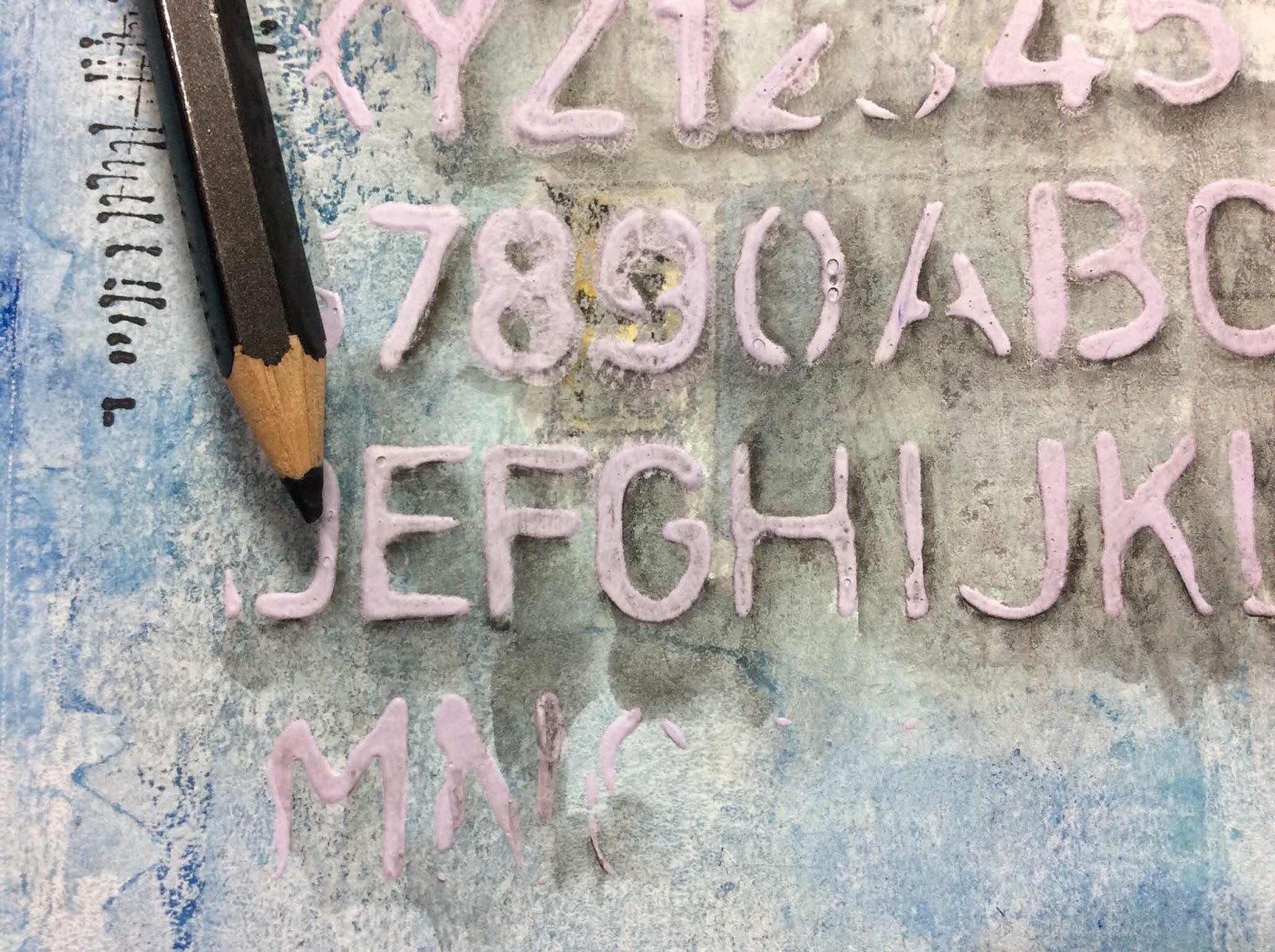
Then I’ll see about some white heavy body acrylic paint tinted with a purple acrylic paint scraped over a stencil.
I didn’t get the next photo, but the textured stencil design was too light. Since the page was again headed to the trash, I tried using a graphite pencil around the stenciled design then smeared with a water brush so that it would stand out better.
It kind of went into a muddy mess. I thought while it was still basically wet I would see if I could wipe off some of the graphite over the letters and numbers toning down the pencil effect. It again seemed saved.

Another punched butterfly from a reject page got a body with a keyhole brad. It’s so fun giving my butterfly’s odd bodies.

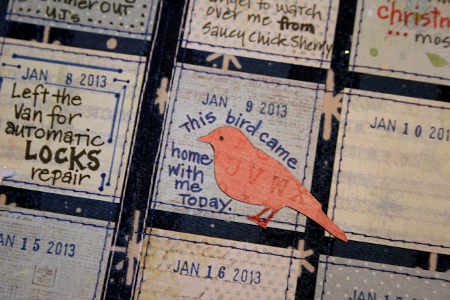
The die cut bird is also cut from the reject page. The math strips are from a paper purchased through Etsy outlined with the graphite pencil then wet and slightly smeared with a water brush. The paper looked to clean and new so I put a little paint on them. That was worse so I tried sanding the paint down which happily grunged everything. The numbers began to disappear so I just traced over them with a marker and sanded them a bit more.

It’s almost easier to make an art journal page when I’ve already decided to trash it!

I definitely learned a lot while making this page.
I definitely learned a lot while making this page.
The whole process was one happy accident after another. This page appeals to my love of grunge.
The “Inspired By” theme at Art Journal Journey runs throughout the month of April.
All mediums are welcome. Come join in!


